News
News >
Behind the cover: Factory 19
We spoke to Regine Abos, cover designer for Factory 19 by Dennis Glover, about the design process.
What made you want to be a designer?
I always liked drawing and making collages as a kid, but never really thought of it as more than just a hobby. But when I was doing my undergraduate economics degree, I joined a literary arts organisation and started doing illustrations for poetry and fiction. I fell in love with the process of creating a visual response to the written word, and from then on I vowed I would never get a job that involved calculating income elasticity of demand! And I didn’t. One of my first full-time jobs was as an editorial assistant/art director in a small children’s book publishing firm, and I never really left the book publishing industry.
What was your process for designing the Factory 19 cover?
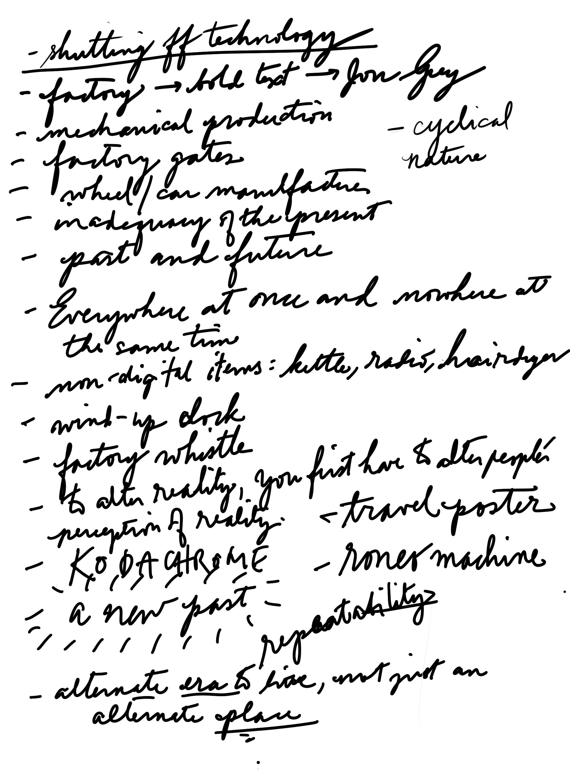
I was super excited about receiving the excellent brief because I was pretty much the target audience described: ‘dystopian literary fiction that will appeal to fans of classics of the genre such as Nineteen Eighty-Four, Animal Farm and A Clockwork Orange’. So even before I read the manuscript, I already knew it was a story I would like. I devoured the manuscript over a weekend, noting down predominant themes – cycles, alternate realities, creating a new past/future – and thinking of imagery that would best represent them. Then I sat down and started to define a few approaches: most were driven by images of old factories, clocks and technology (this involved looking through image libraries), a few used type as image (which I sketched) and one was driven by printing finishes (I browsed through paper samples I had and my Penguin Great Books series).

Tell us a little about the various design concepts. Why do you think the final version won?
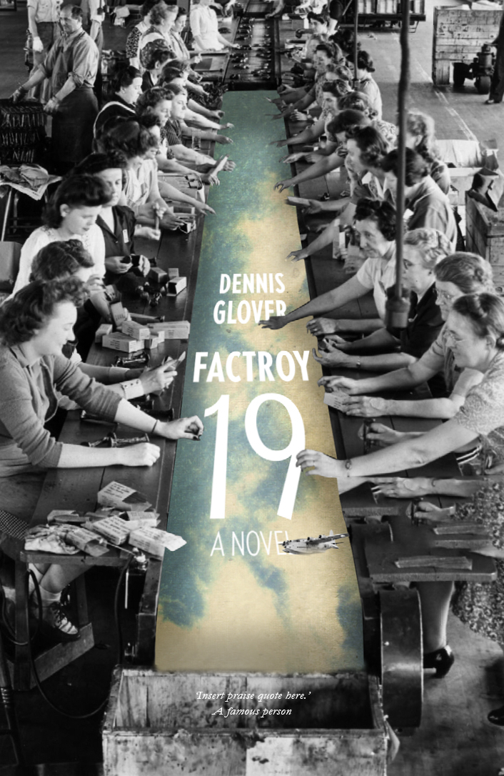
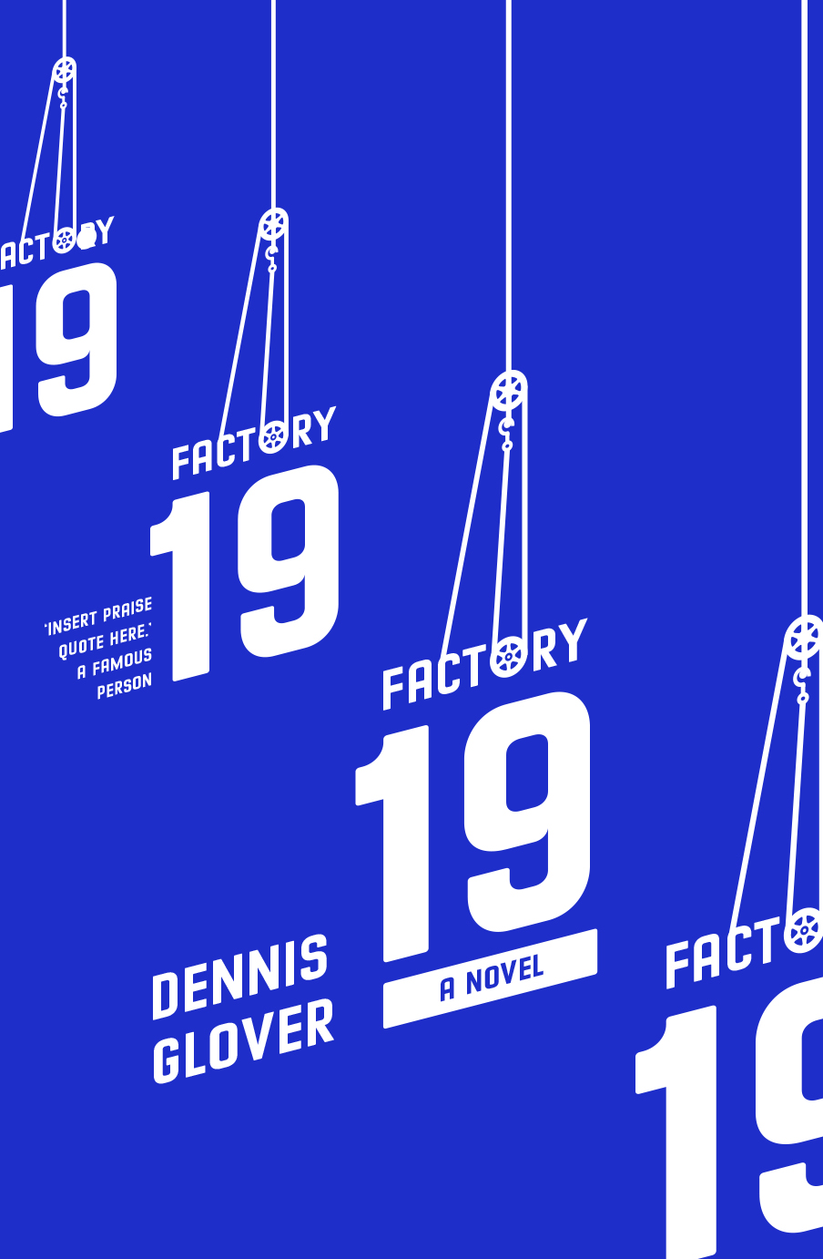
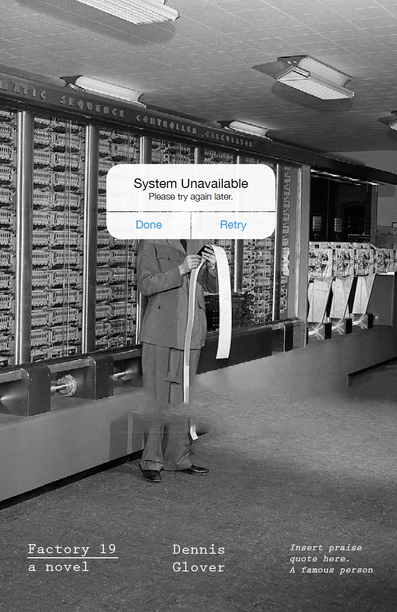
I was very lucky to have a few of the first-round concepts be considered straightaway as viable options. The typographic approach was one of the forerunners: the repetition of the title alluded to mechanical reproduction and the assembly line and also hinted at history repeating itself. This cyclical nature was also represented by the wheel/pulley structure. The other concept that was considered closely was the surreal collage approach: it featured factory employees in the 1940s working to assemble their ideal lives/dreams (represented by the sky). The ‘Kodachrome’ colours and the disjointed perspective of the 1940s flying boat also give a sense of an alternative reality.
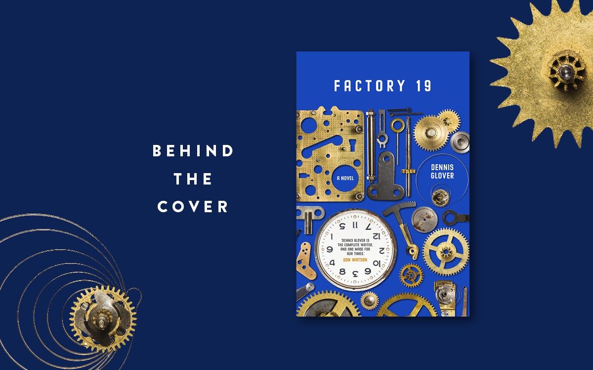
But the concept that was chosen in the end – perhaps because of its accessibility – was the clock: it looked at the dismantled mechanical instrument as a representation of the breakdown of time. It asked the questions Are we living in the future? Or is this the past? The numbers on the clock’s face were jumbled and turned the wrong way around to further reinforce this idea, except for 1-9-4-8, which is the year that the key character, Dundas Faussett, re-creates in the book as the ideal time to live. The ‘parts forming a whole’ approach also alluded to mechanical assembly in a factory.
What do you think a cover should do for the book it represents?
I’ll answer that question by quoting author Jhumpa Lahiri in her book, The Clothing of Books: ‘The right cover is like a beautiful coat, elegant and warm, wrapping my words as they travel through the world, on their way to keep an appointment with my readers. The wrong cover is cumbersome, suffocating. Or it is like a too-tight sweater: inadequate. A good cover is flattering. I feel myself listened to, understood. A bad cover is like an enemy; I find it hateful.’
How much of the text do you usually read before you start designing?
For fiction, definitely all of it. There is merit in reading the publisher’s brief, but a visual thinker might have different insights into the text to that of the publishing team. For non-fiction, I usually read the introduction and one or two other chapters of the manuscript. Good design elicits an emotional response and that can only be brought about if the designer themselves has an emotional connection to whatever they’re designing. In book design, that connection comes from reading and absorbing the text thoroughly.
What’s your favourite book cover trend at the moment?
I don’t think this qualifies as a trend, but understated, ‘under-designed’ book covers really appeal to me. If there’s a cover set in one solid colour with a meticulously designed typeface, that’s usually enough for me to pick it up and search the imprint page for the design credit. People often underestimate simplicity – simple is difficult; simplistic is lazy. There’s a fine line.
Any tips for people looking to get into the industry?
1) Develop a love for reading if you don’t have it already.
2) Never burn any bridges with people you work or study with. The Australian design industry is small and incestuous.
And any parting thoughts or comments?
At the risk of sounding like a Hollywood actress at the Oscars, I would sincerely like to thank the good folk at Black Inc. for giving me the opportunity to clothe Dennis Glover’s witty words. I do hope readers will enjoy this book as much as I’ve enjoyed designing it.
Find out more about Regine and her work at studioregina.work.


